Initial online reaction was not good, to say the least
Cadets at RMC could soon be sporting a new look.
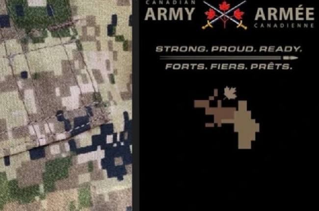
The Canadian Army's new logo, recently unveiled online, has faced widespread backlash, with many social media users mocking its design. The logo, featuring a tilted maple leaf and a pixilated camouflage pattern, was compared by some to a bear or man having sex with a moose, sparking a wave of memes and criticism.
The logo was developed in-house by the Army's graphic design team, aiming to highlight the colors in the Army’s new camouflage pattern. Despite the controversy, Army documents show that the logo was carefully planned and approved by military leadership without any objections.
Conservative MPs accused the Liberal government of forcing the new design on the Army, but official documents reveal it was an Army-led initiative.
The new logo is part of a broader branding strategy to enhance the Army’s credibility. The design process incurred no additional cost to taxpayers.

 Big changes coming to Kingston food bank as it moves to new home
 AMO Remains Positive and Prepared in Face of Trade War
 Kingston teen missing
 Police seek suspects in Hargreaves Way break-in
 Kingston Police searching for missing 66-year-old last seen near Division Street


